
Indiana COVID-19 County-Level Cases and Risk Factors
Polis Center Geoinformatics Director Jim Sparks wrote the following article as a guest blog post for GISCafe.
Humankind has been making maps since the time we developed language, and perhaps before. The earliest known map consisted of lines and symbols carved into a flat rock to depict water flow, nearby mountains, and locations of animals that lived in the area. Archeologists discovered the 13,000-year-old map in a cave in northern Spain. It is within the limits of imagination to think that the elements depicted on the stone were extremely important to that ancient cave dweller, and perhaps contributed to his survival.
Centuries later, around 600 BCE, the Babylonians sought to show their city within the context of a larger world. A clay tablet, the Imago Mundi, survives from that time and shows the city of Babylonia figuratively as a circle surrounded by the larger circle of land mass, which in turn was surrounded by a “bitter river” that held seven islands. Travelers beware, though – the sixth island is “where a horned bull dwells and attacks the newcomer.”
By the early 1300s ADE, Italian geographer Pietro Vesconte was using compass derived angles and estimated distances to map coastlines to a much higher degree of realism and accuracy. These portolan charts (navigational maps) helped sailors navigate safely away from the ragged Mediterranean coasts, and eventually, in 1321 with his world map, included the coastlines of norther Europe.
Maps, and the software used to produce them – most notably Geographic Information Systems (GIS) played a critical role in the initial rescue and relief operations immediately after the attack on the World Trade Center in New York City on September 11, 2001. In the words of Michael J. Kevany, who participated in the WTC response as a member of the Emergency Mapping and Data Center component of the Emergency Operations Center, “The [9-11] event exposed and promoted the value and usefulness to the emergency management community of presentation of information in a visual/map format.”
Of course, we continue to use maps today. More than a billion people around the world access Google Maps every day. Google, with their Google Map and Google Earth products, set a new standard for how we can easily access and use modern maps, usually for matters of convenience, like finding an address in an unfamiliar city. As a result, now we are also comfortable consuming weather maps, political maps, and earthquake and tsunami maps as a normal part of our day.
But the value and usefulness of maps during a national crisis has been demonstrated again, almost overnight, as maps are helping us all make sense of the well over a million confirmed COVID-19 cases around the globe. As deaths due to coronavirus have exceeded 200,000 worldwide, commerce has come to a standstill, and people are sheltering in place at home, who by now has not seen the excellent dashboard maps produced by Johns Hopkins University (https://coronavirus.jhu.edu/map.html)? First shared on January 22, 2020, these maps were created by Professor Lauren Gardner and graduate student Ensheng Dong to provide an at-a-glance daily status of total confirmed Covid-19 cases, total deaths, and total recovered. Numerous media outlets have used these maps during their reporting, including ABC News, PBS News Hour, and Newsweek magazine. In fact, by late March 2020, visitors to the website had accessed the underlying data as many as 1.2 billion times, proving that maps are important again!
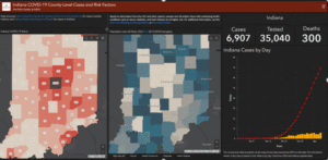
Closer to home, experts at the Polis Center, an applied research unit at IUPUI in Indianapolis, have created an information hub (https://polis.iupui.edu/savi-indiana-coronavirus-data-hub/) containing maps to help inform the public and provide a resource to state policy makers during the COVID-19 public health crisis. The hub pulls data from the Johns Hopkins website, the Indiana State Department of Health, the Indiana Management and Performance Hub (MPH), and the center’s own community research infrastructure (SAVI) to track county-by-county impacts of the epidemic. The hub also contains maps, like the one below, with county and neighborhood level data to call attention to underlying COVID-19 risk factors and social consequences such as isolation among the older population and locations of food and meal providers.
Why maps?
Since the very beginning of human history, maps have served to tell stories, to communicate important information in a meaningful intuitive way, to inform public policy, and to save lives. Why do we prefer this method of communication? Perhaps one reason is that geospatial data, information about the location of things and the stuff from which maps are built, is widely applicable across the range of human activities. In fact, in a 2012 study in the UK, Deloitte, working with the Open Data Institute, found that geospatial data was the category of open data that was applicable across the most sectors of the economy. These 19 sectors included agriculture, transportation, human health, manufacturing, construction, education, etc. In other words, geospatial data and the maps we make from them are enormously relevant to most of what we do.
A greater reason for our affinity to maps is that we seem to be wired to interpret the physical world using maps. Edward C. Tolman published “Cognitive Maps in Rats and Men” (1948) and postulated that people develop internal “cognitive maps” of our physical environment that help us navigate to a physical world destination by knowing where it exists in our mental map. Maps are part of who and what we are!
The current pandemic reminds us that maps are still an important way for us to understand the physical world, just as they have been all along.